Experian · 2022–24 · Lead Product Designer
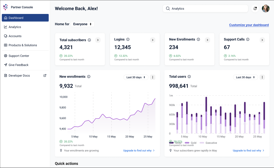
Experian Partner Platform
A self-serve SaaS platform for banks and fintechs to integrate, brand, and manage Experian products.
- 86%
- Faster partner integration
- 18 mo → weeks
- Time to launch an Experian product
- 6
- Rounds of concept and usability testing
The problem
Experian Partner Solutions sells credit and identity products to banks and fintechs — Chase, Amex, and a long tail of growing startups — who embed them inside their own apps. Every one of those integrations was bespoke: a sales engineer, a spreadsheet of SKUs, a shared inbox for API keys, and a lot of waiting.
On average, it took a partner 18 months from signed contract to a product in front of their users. For a fintech that’s an eternity; for Experian it was revenue stuck in a queue. Leadership wanted a platform where partners could integrate, brand, and manage Experian products themselves.
I led the design of that platform from a blank page to launch.
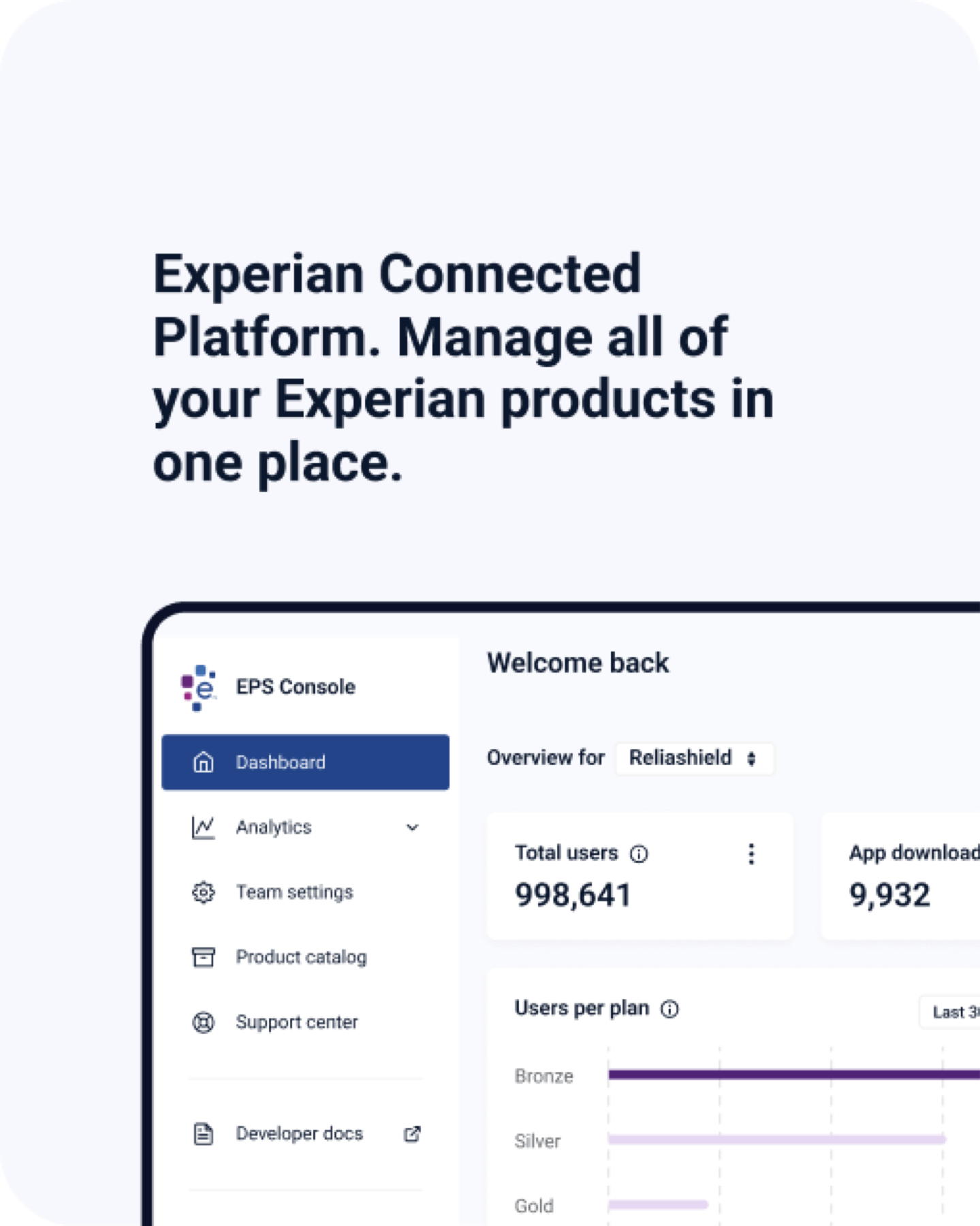
My role
Lead Product Designer, owning UX strategy, research, information architecture, interaction and visual design, and the platform’s design system extension. I worked directly with the GM, product, engineering, sales engineering, and marketing, and pulled in two additional designers at critical points to scale the work.
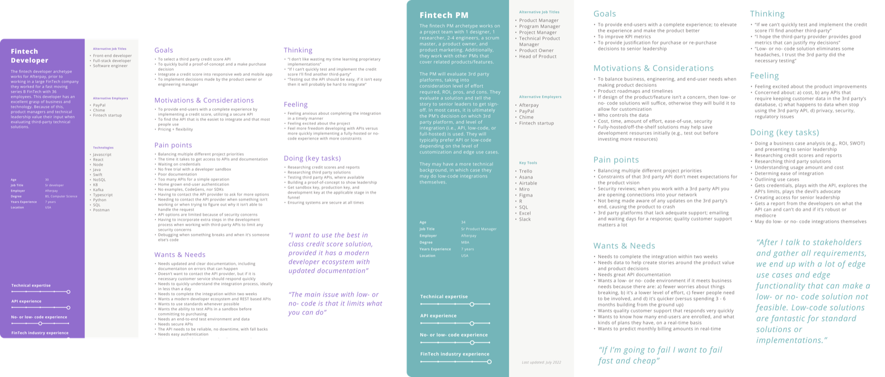
Who we were designing for
The partner side of a B2B2C product is not one person. Discovery interviews with partner teams, sales engineers, and support surfaced two very different primary users with opposite needs.
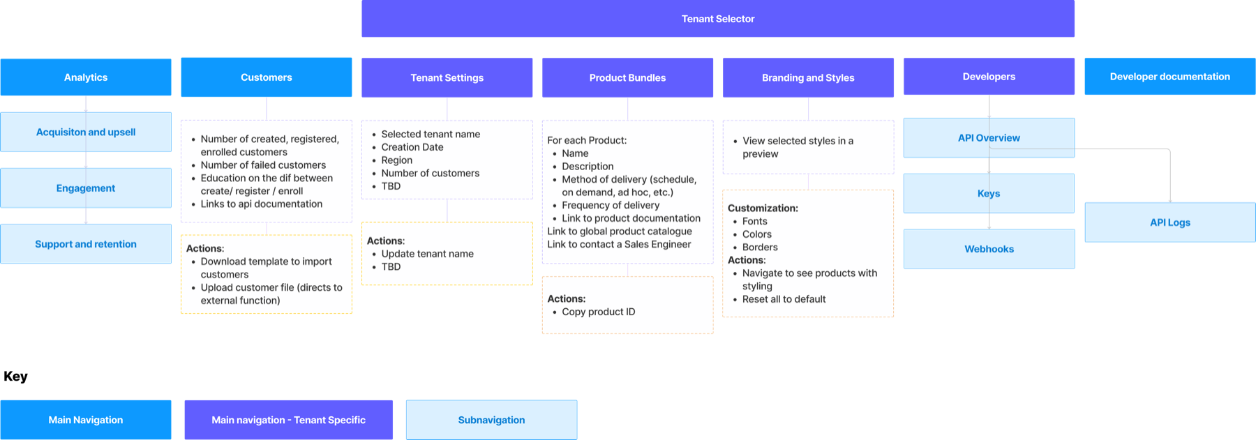
Mapping the work
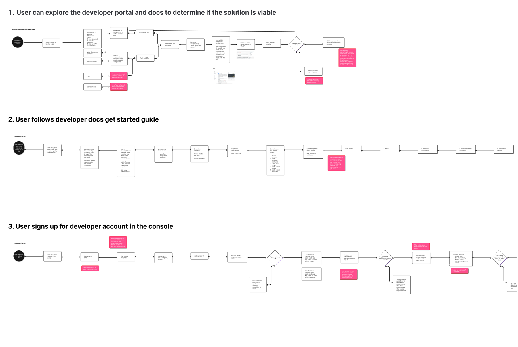
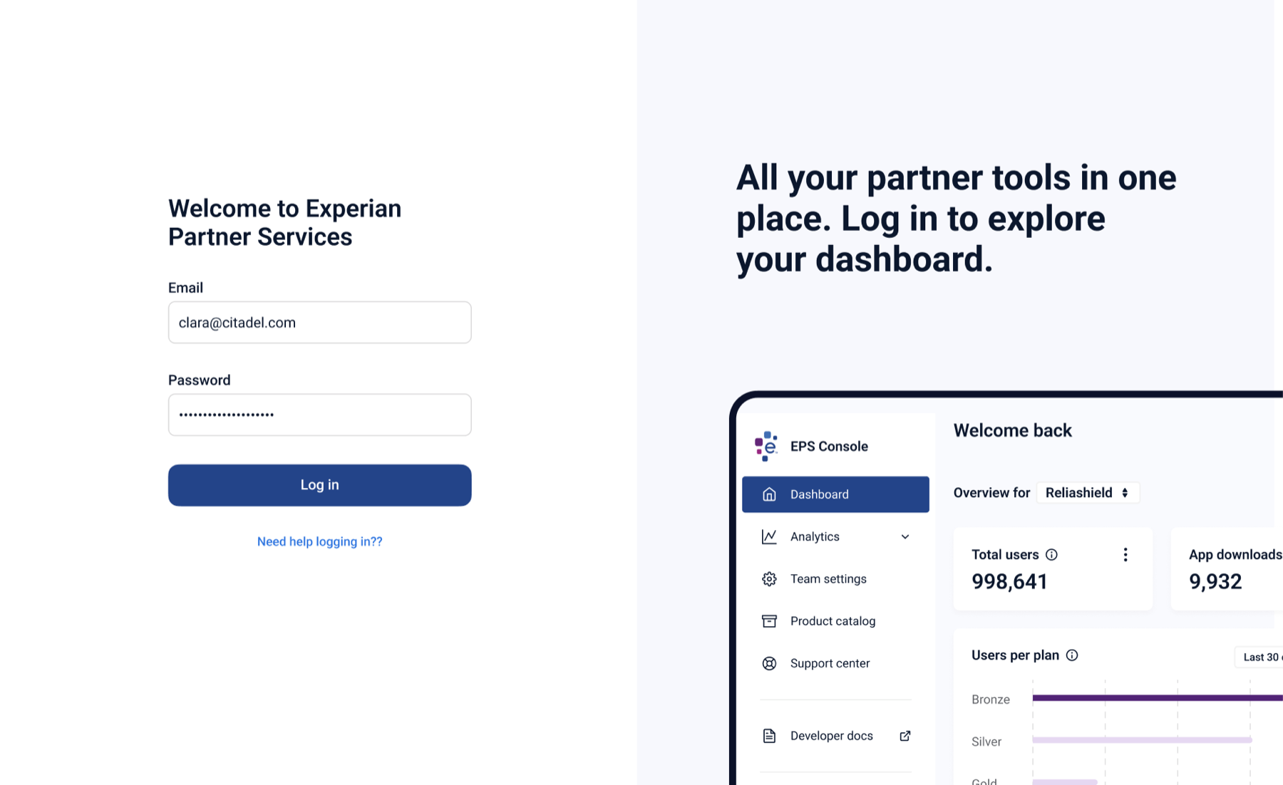
With personas in hand I mapped the three journeys that mattered most: exploring the docs to decide if Experian was viable, following a getting-started guide, and creating a developer account in the console. Each flow surfaced dead ends in the existing process — points where a partner had to email someone and wait.
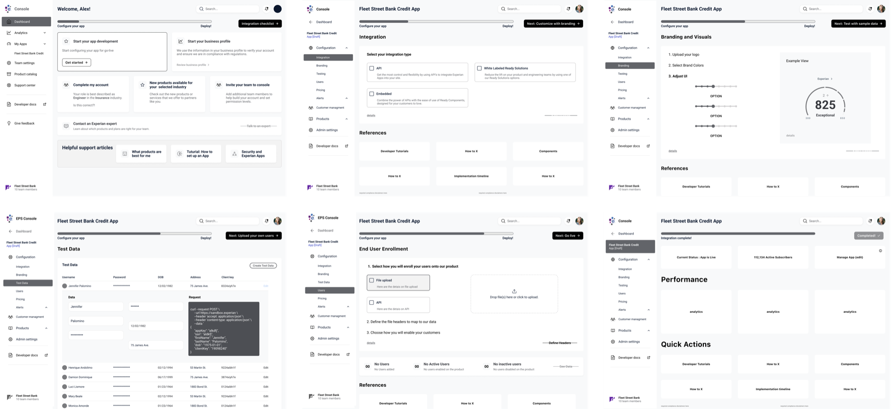
From wireframes to a working console
I wireframed the whole console before touching visual design, and tested the wireframes with partners. The structure barely changed after that; the detail changed constantly.
01
Discovery
Partner and internal interviews, business requirements, design principles.
02
Structure
Personas, journey maps, information architecture, wireframes, clickable prototype.
03
Concept testing
Three rounds with 10 partner-side participants each; the wireframes were rewritten between rounds.
04
Visual design and system
High-fidelity screens built on an extended version of Experian's design system.
05
Usability testing
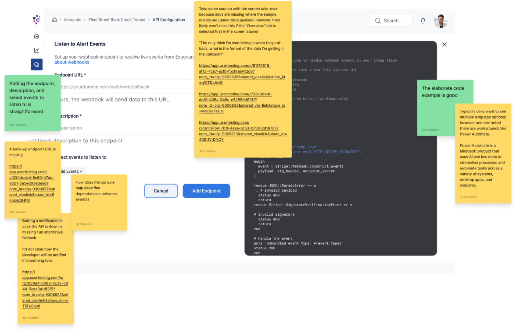
Three rounds on the high-fidelity prototype, focused on the developer flows.
06
Launch and iterate
Shipped with the first partner cohort; post-launch iteration on enrollment and branding.
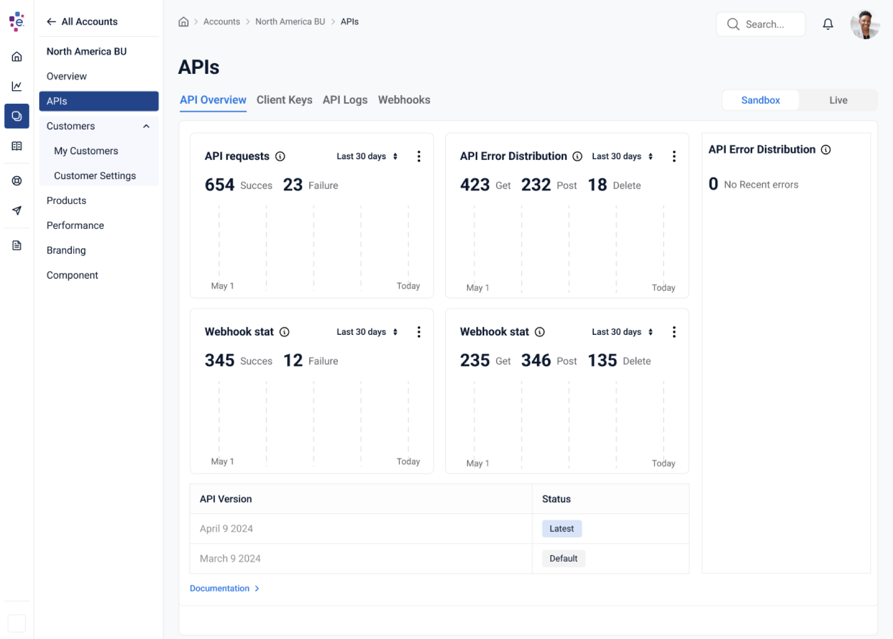
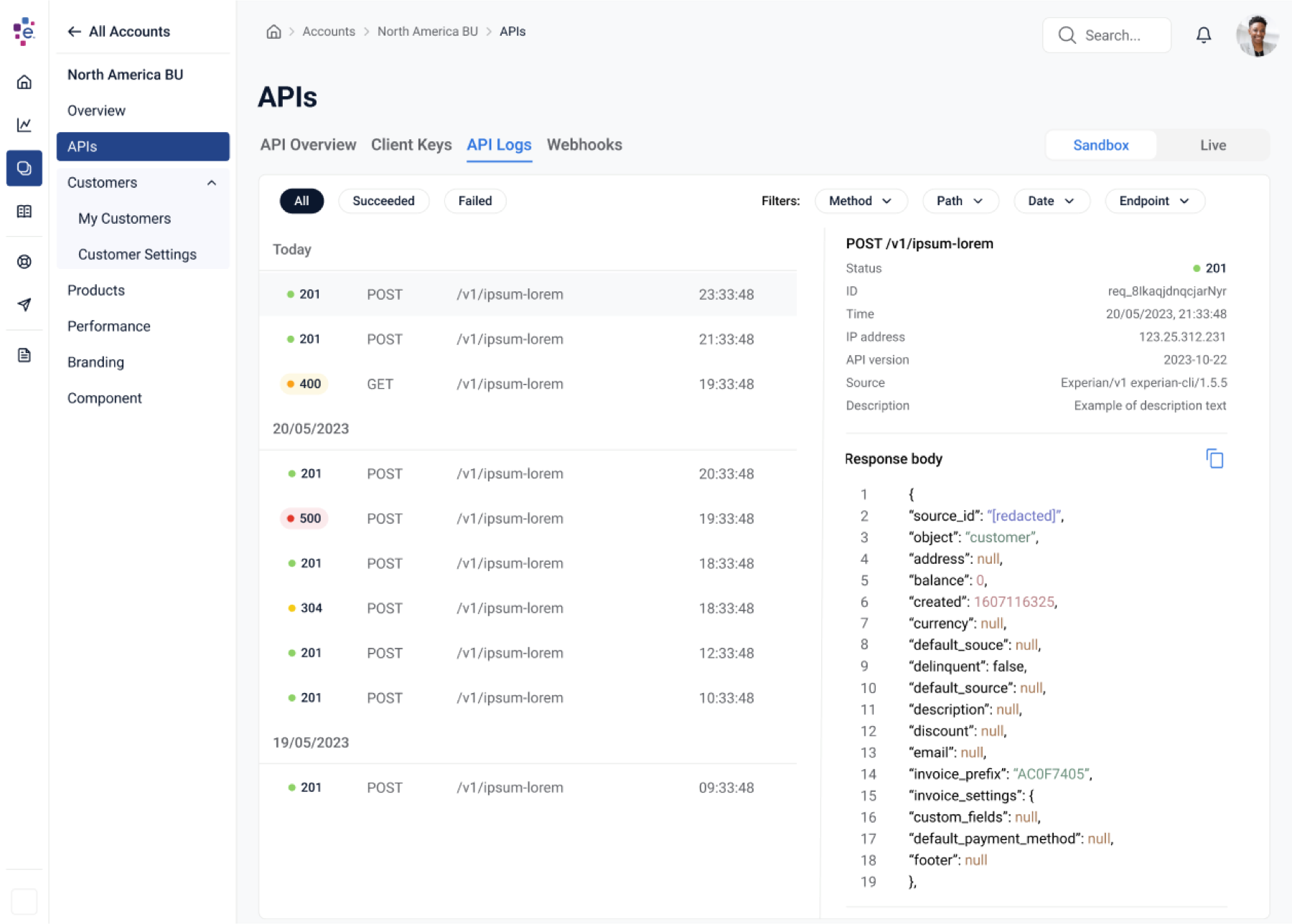
The developer experience
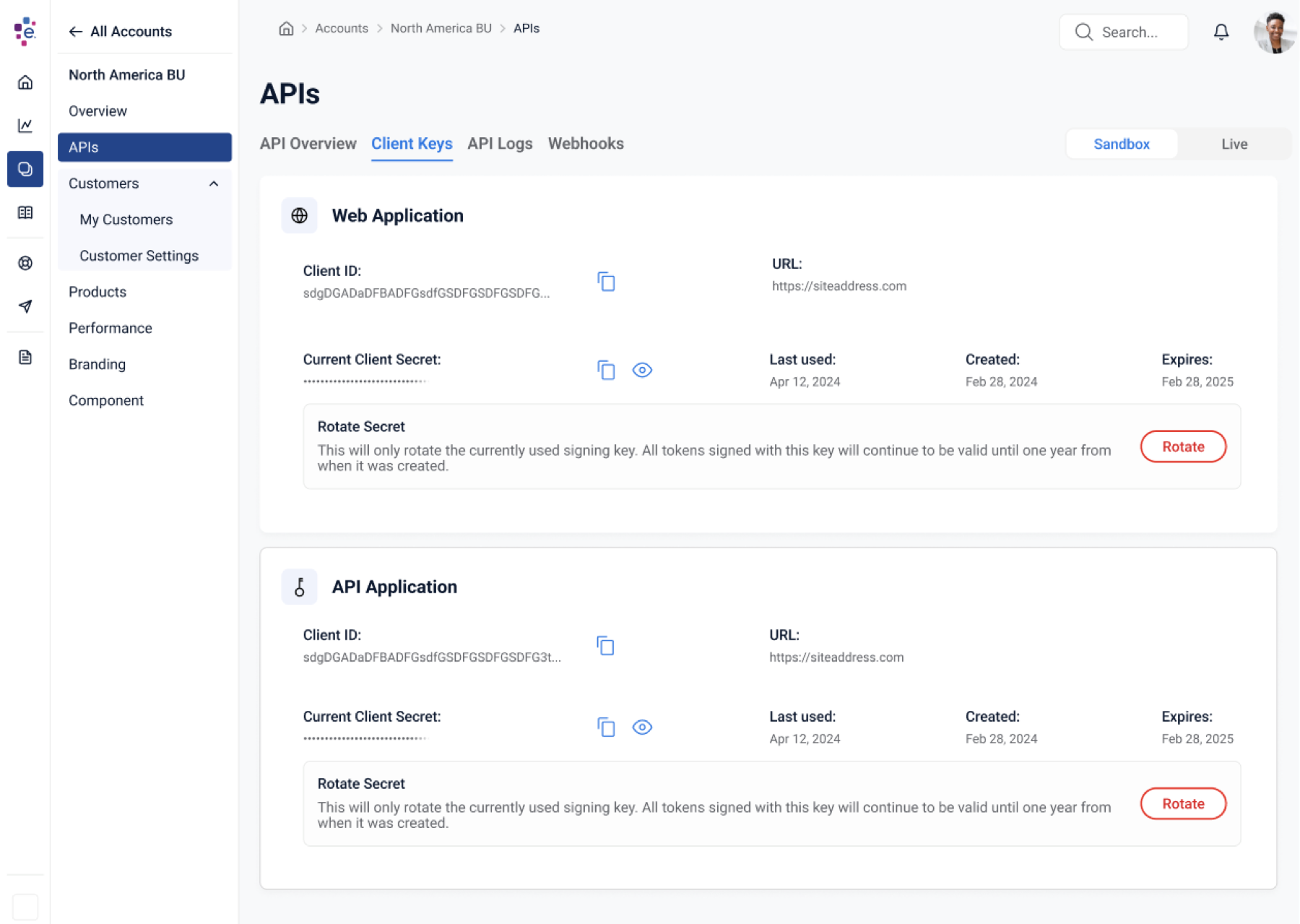
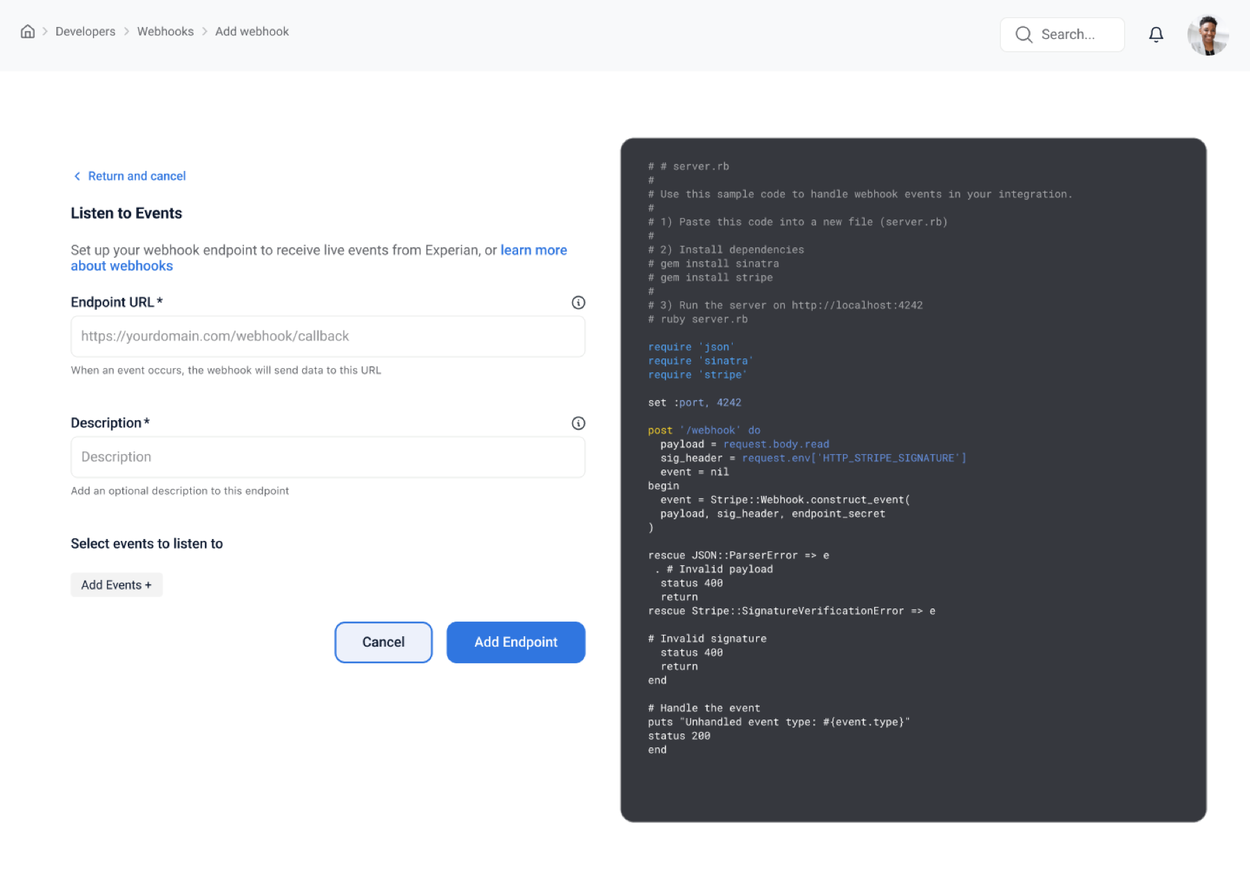
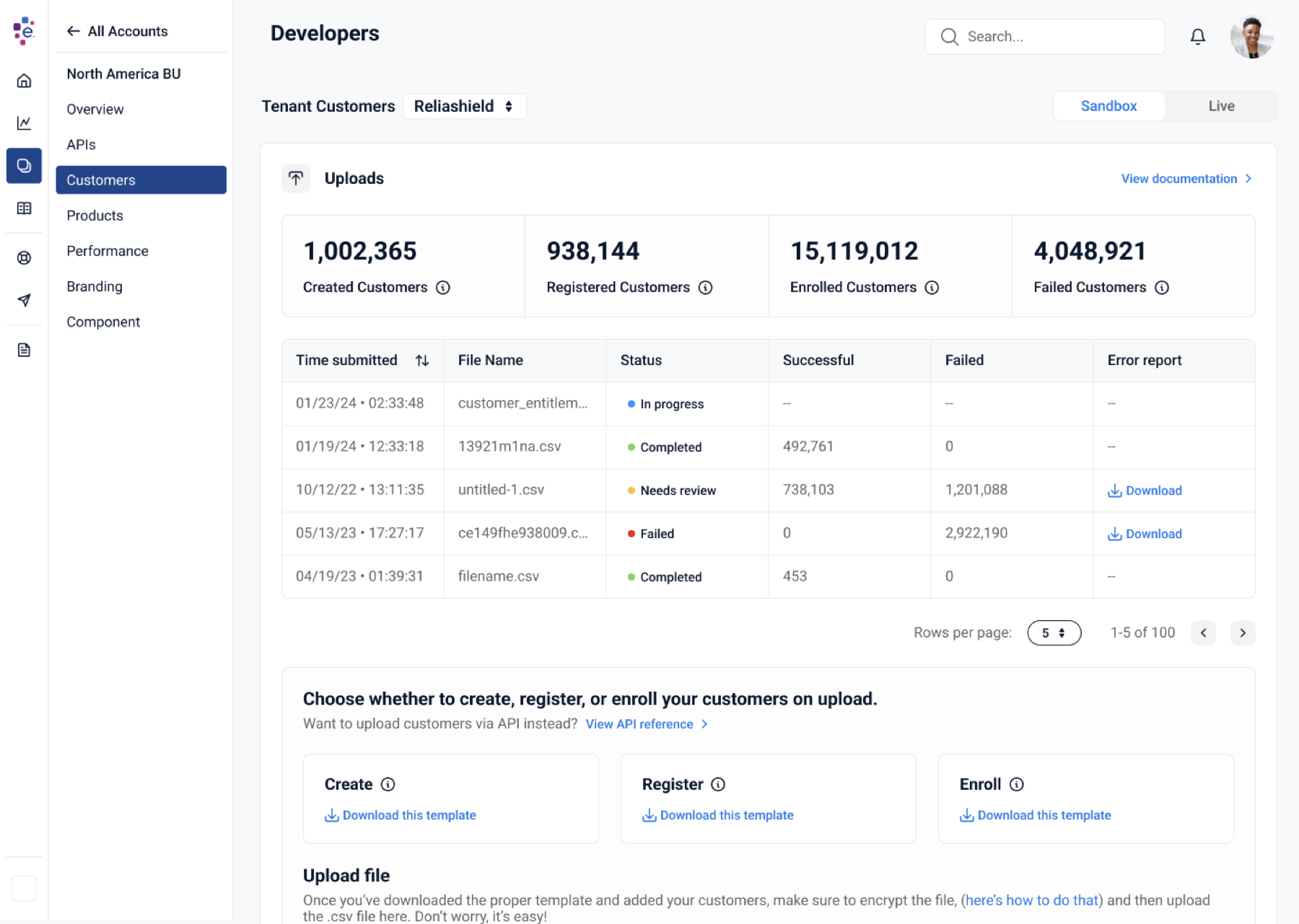
The first thing a developer does is look for keys, logs, and a webhook. So those got the most care.
Designing for scale
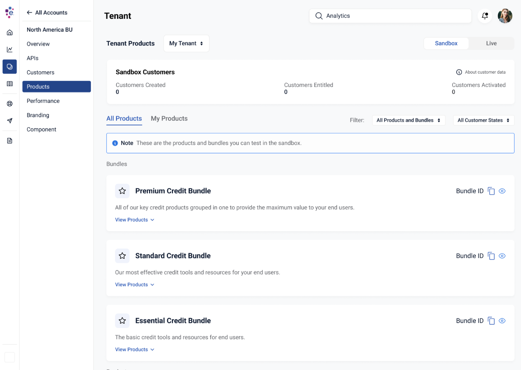
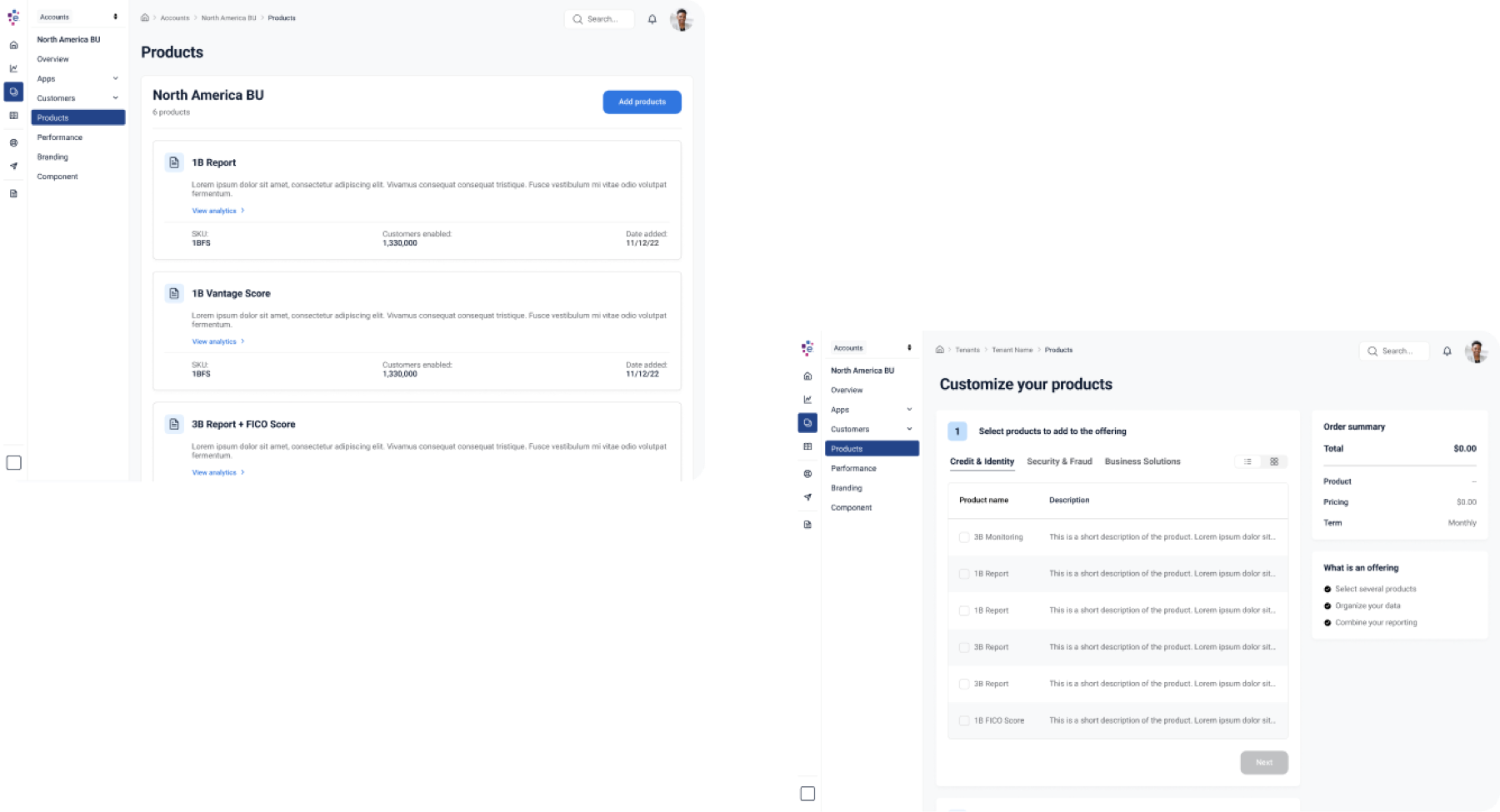
A partner should be able to grow with Experian without another sales cycle. I designed the product catalog around bundles and self-serve purchase, so a partner starting with one credit score could add reports, identity tools, and full bundles from inside the console.
Enabling customization
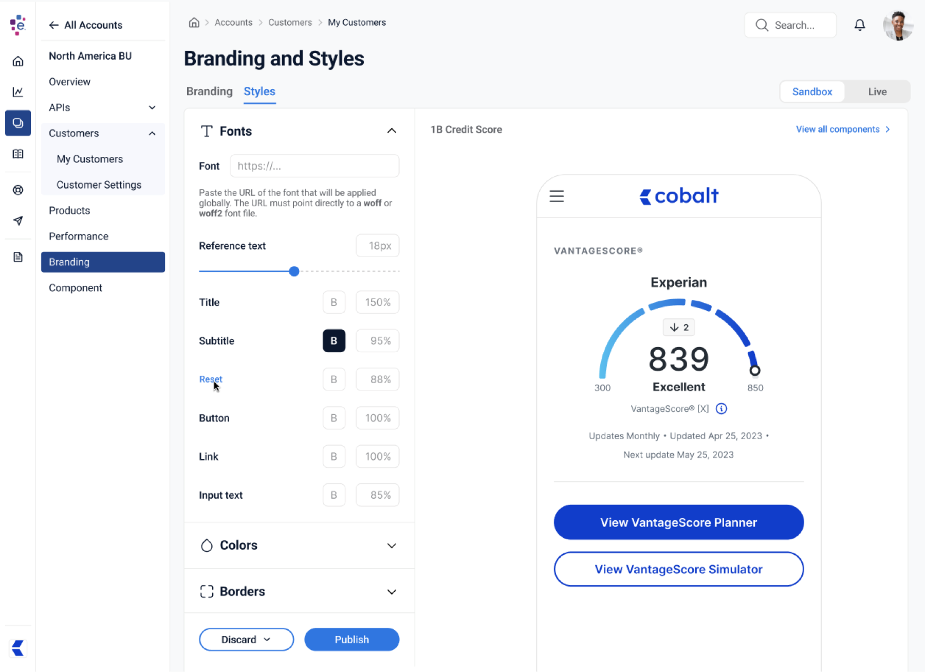
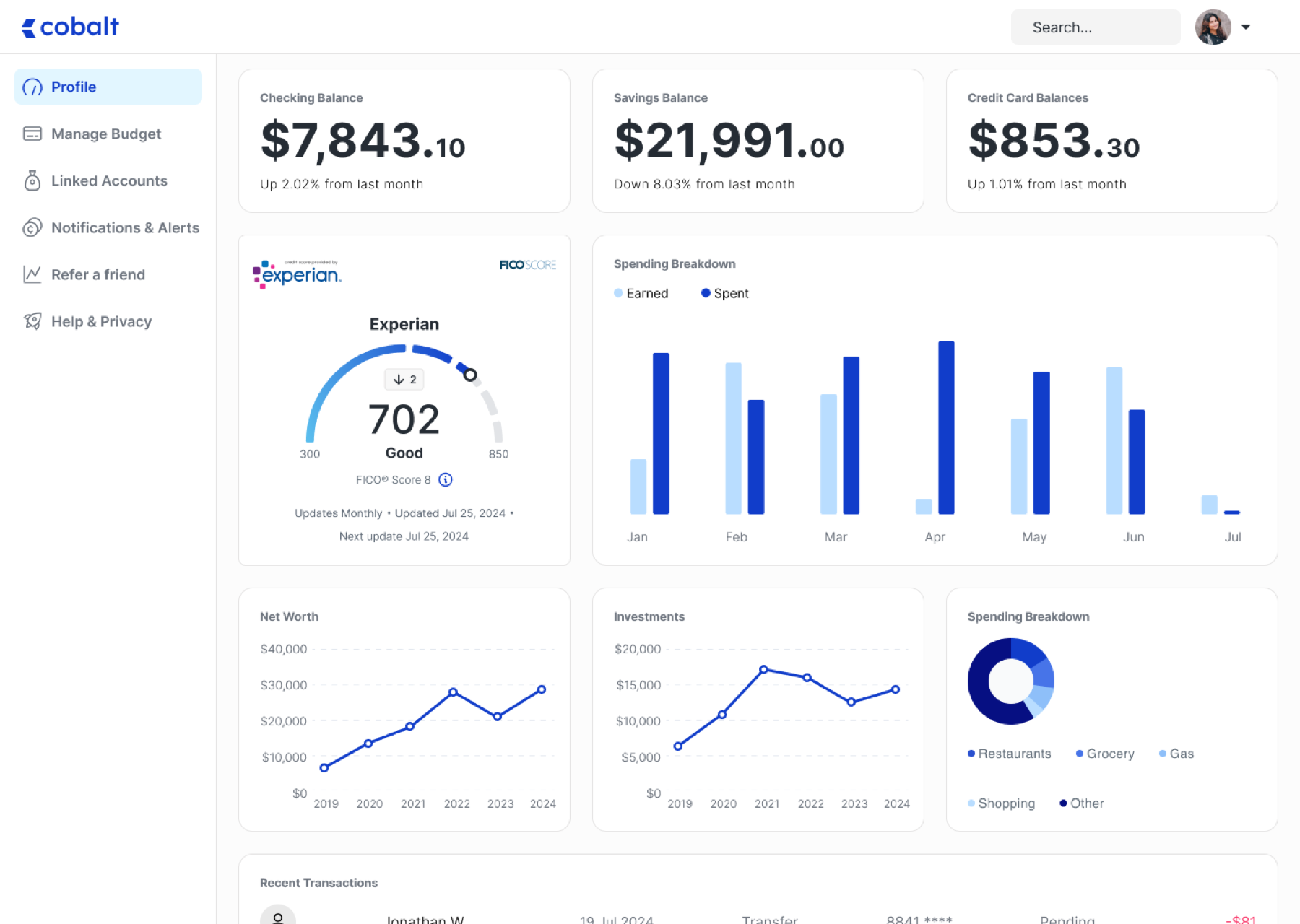
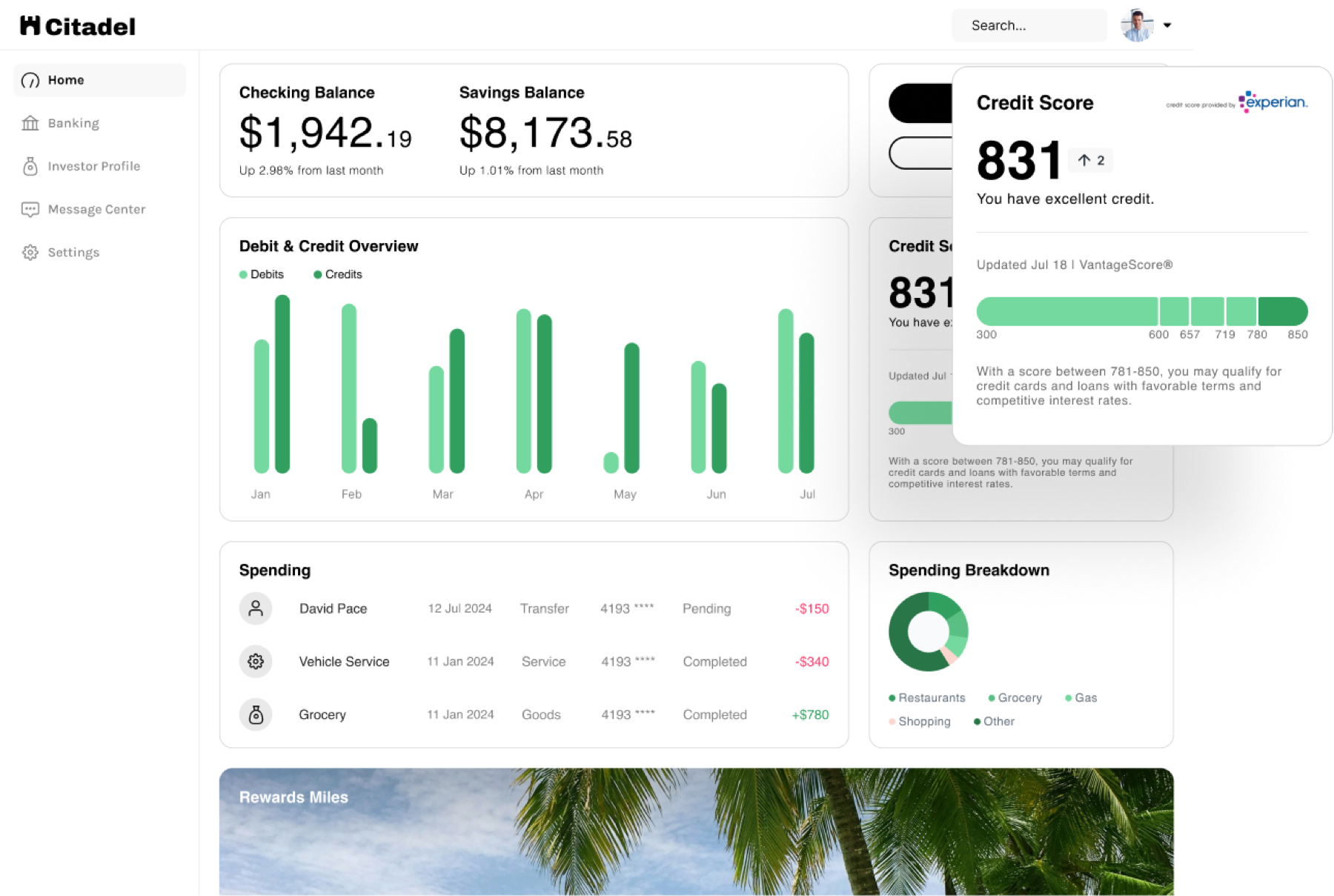
Our team also built a set of white-labeled, embeddable components — the credit score widget a bank’s customer actually sees. Partners needed to make those feel like their own brand without a design review, so I designed branding and style tools with a live preview.
Design system
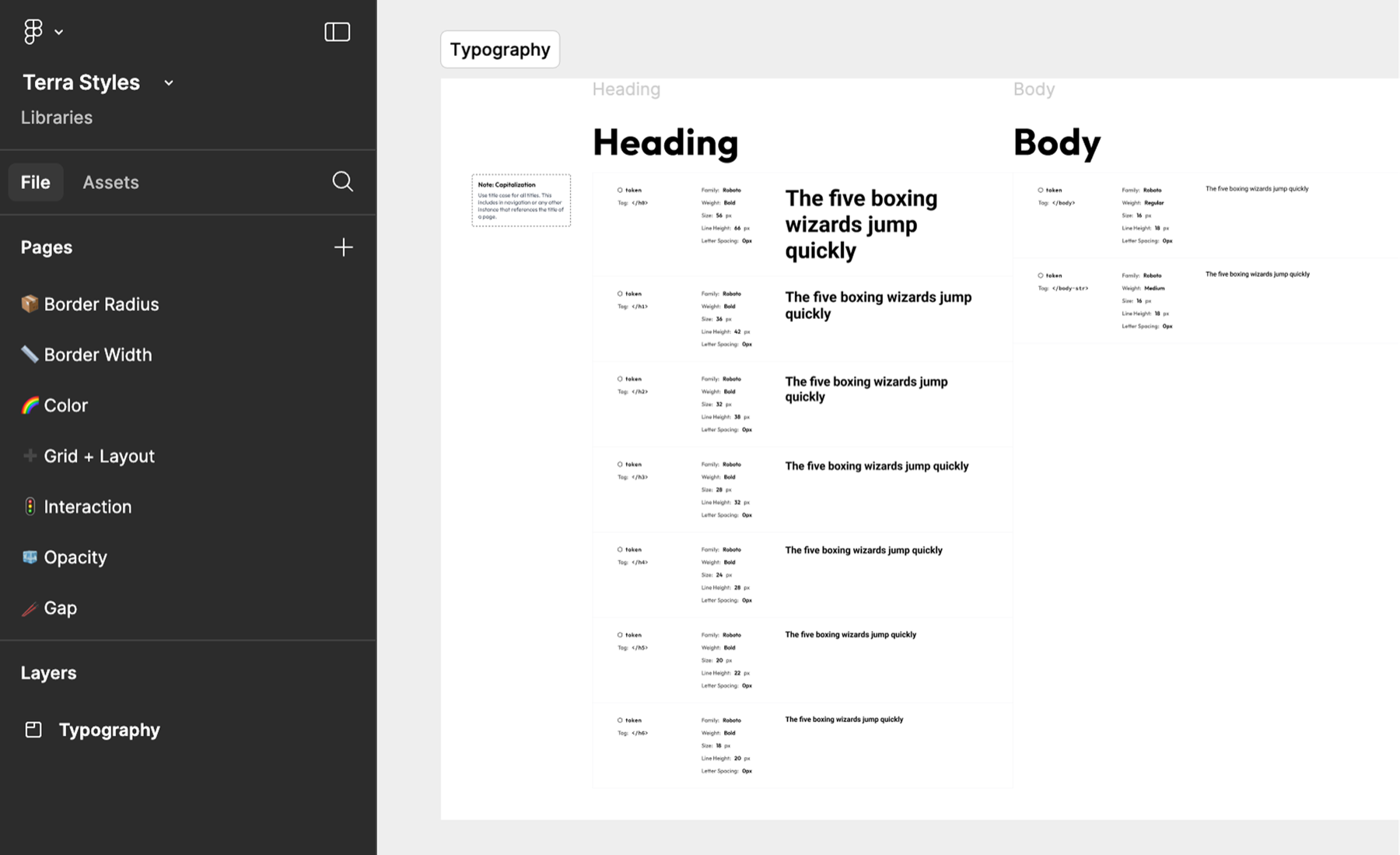
I partnered with Experian’s design-systems lead to extend the existing system for a SaaS context. The goal was to keep implementation lean: reuse everything we could, and add only what a dense data tool needed — tighter type scale, table patterns, status colors, and code presentation.
Leadership
This wasn’t a redesign; it was a new line of business. Beyond the screens, the work that mattered most was:
- Setting the UX vision and holding it across a year of shifting requirements.
- Managing up — running strategy workshops with leadership to align on what the platform was for, and what it wasn’t.
- Cross-functional coordination across product, engineering, sales, and marketing, so requirements reflected both user and business needs.
- Scaling the team — bringing in designers at the right moments and giving them well-scoped problems.
- Owning research, from the first discovery interviews to the last usability round.
Outcome
Partner integration time improved by 86%. What had been an 18-month, high-touch process became something a partner’s developer could start on a Tuesday. The platform became the default way Experian Partner Solutions onboards new partners.