Experian · 2023–24 · Lead Product Designer
Credit Center
Credit monitoring that tells people what to do next — mobile-first, personalized, and white-label ready.
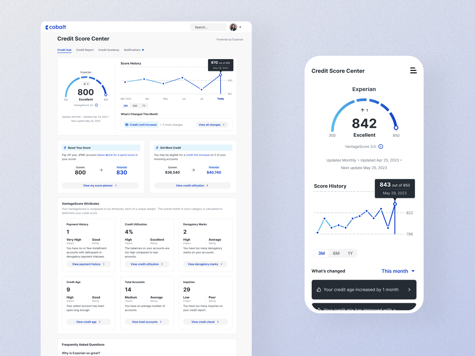
- 98.4
- System Usability Scale score
- +46%
- Engagement with insights
- 100%
- Of testers rated it Excellent or better
The problem
Experian’s white-label credit monitoring product is what a bank’s customers see when they tap “Credit score” in their banking app. It reached millions of people through partners — and most of them looked at their score once and never came back.
The existing experience read like a blog. Key tools were buried, the mobile experience was an afterthought, and it lagged well behind Credit Karma and NerdWallet. Engagement was low, and partners were starting to ask why they should keep paying for it.
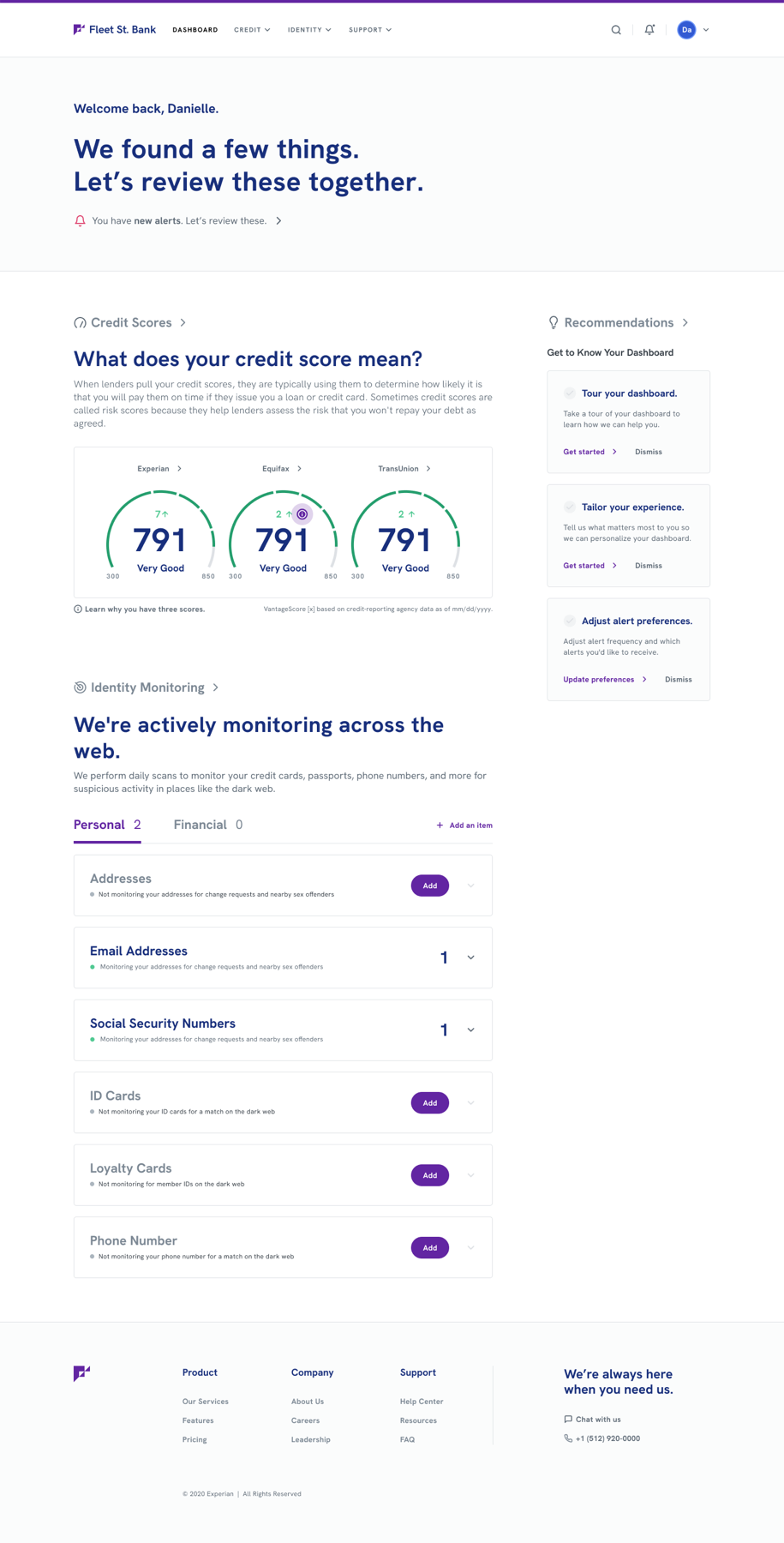
My role
Lead Product Designer — UX strategy, research, and UI design, working with a product manager, a content strategist, and the engineering team building the white-label component system.
What users told us
We interviewed current users of the product across several partner banks. Four quotes shaped the brief:
“I checked my score once, but there’s no reason to come back. Nothing changes, and I don’t know what else I’m supposed to do here.”
“I didn’t even realize there were tools to help me improve my credit. They’re buried — I had to click around a lot to find anything useful.”
“I mostly check my credit on my phone, but the site isn’t easy to use. I have to scroll for days to read everything.”
“Credit Karma makes it easier to understand what’s affecting my credit. This one just throws a bunch of information at me.”
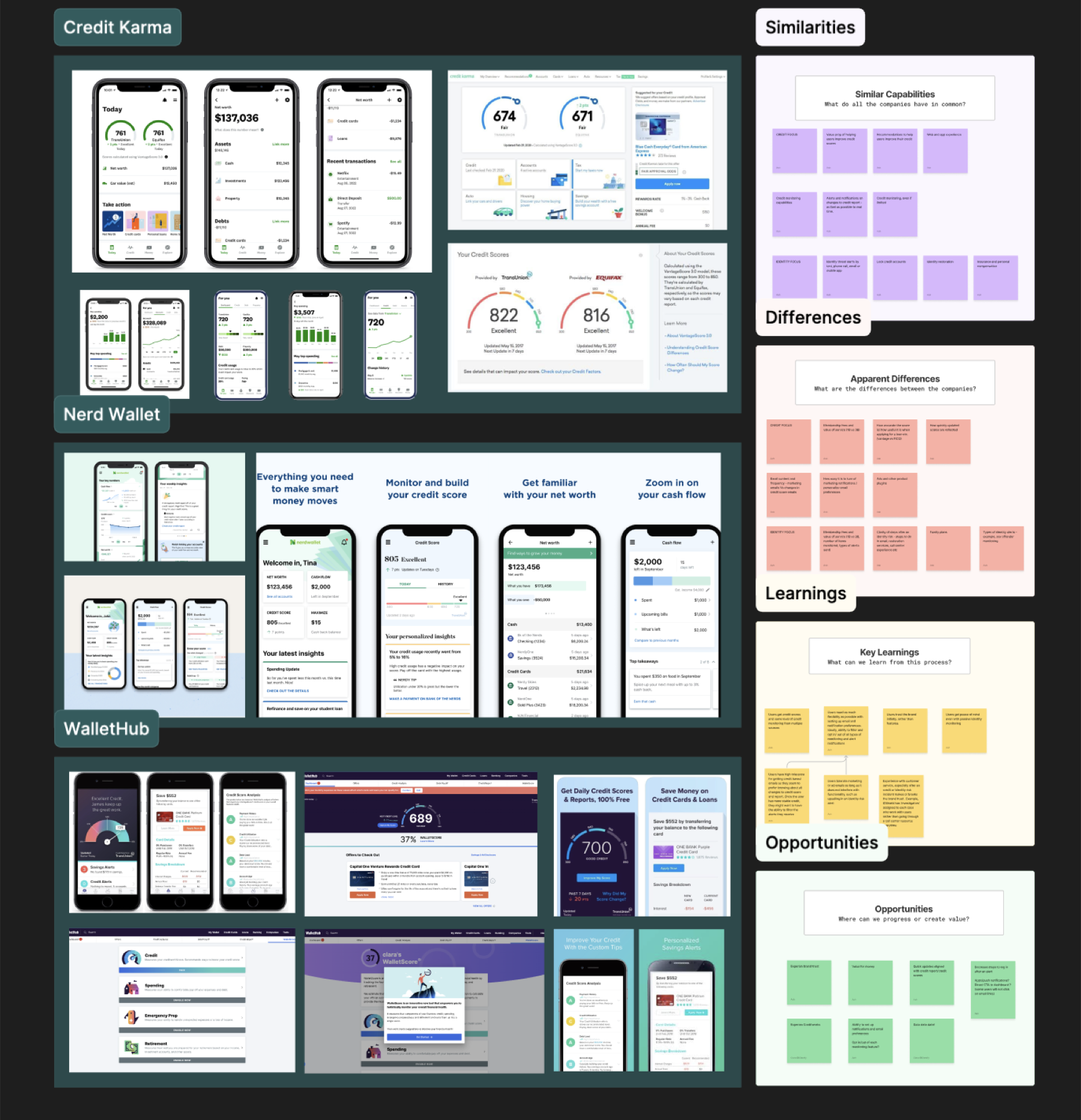
Strategy
Four bets, in priority order:
Ideation
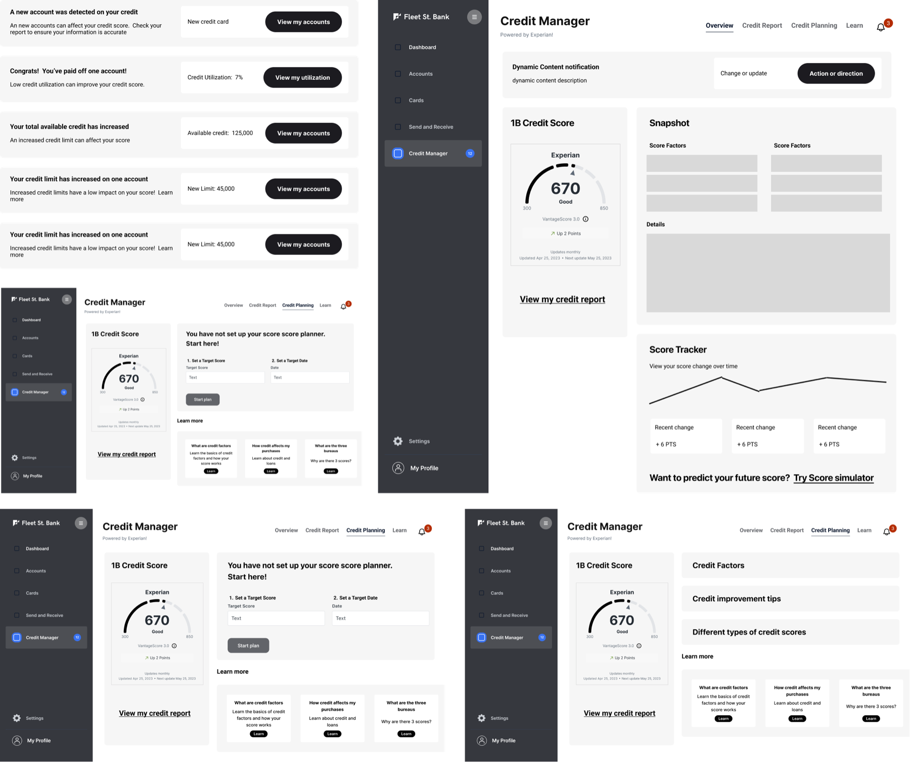
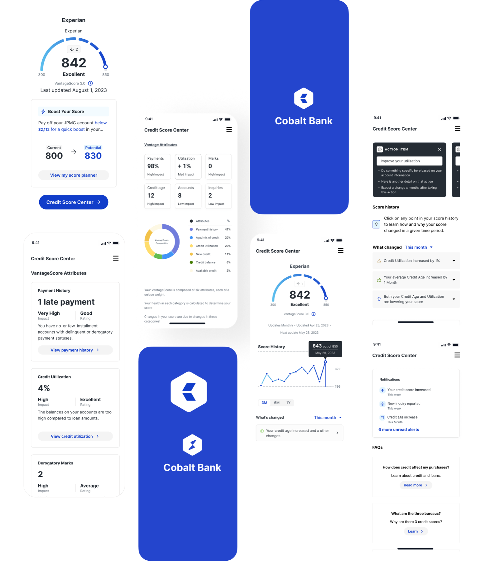
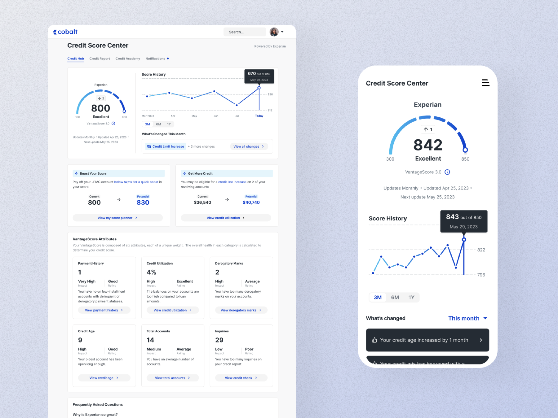
The design
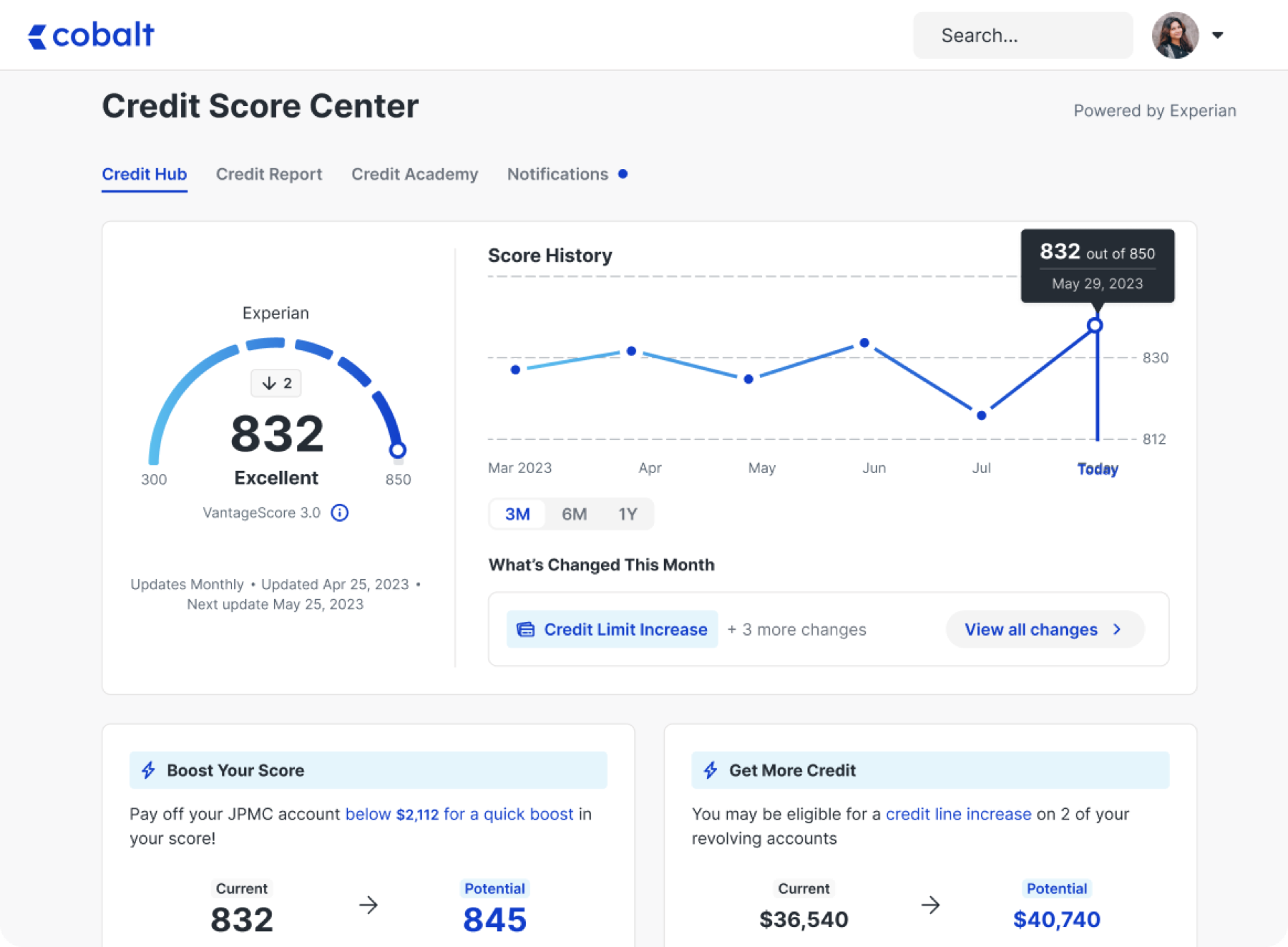
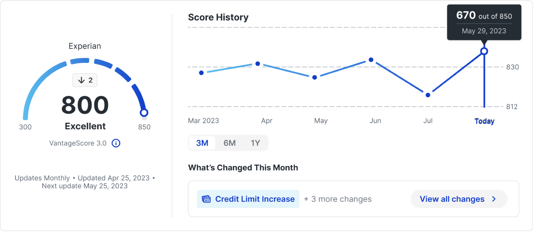
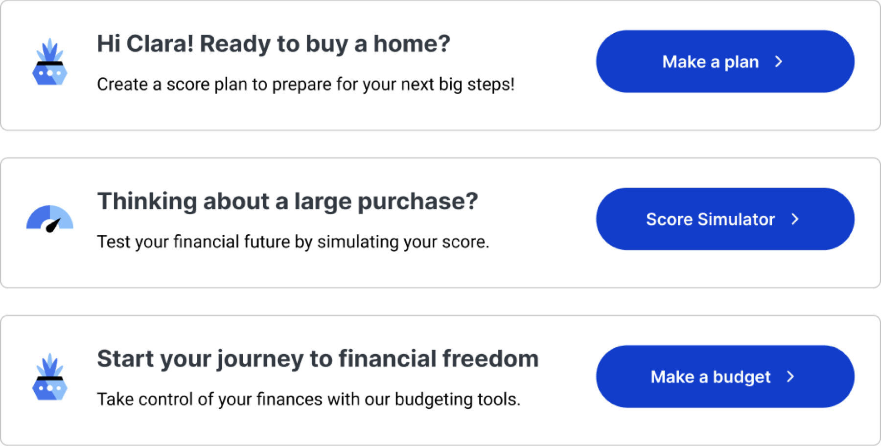
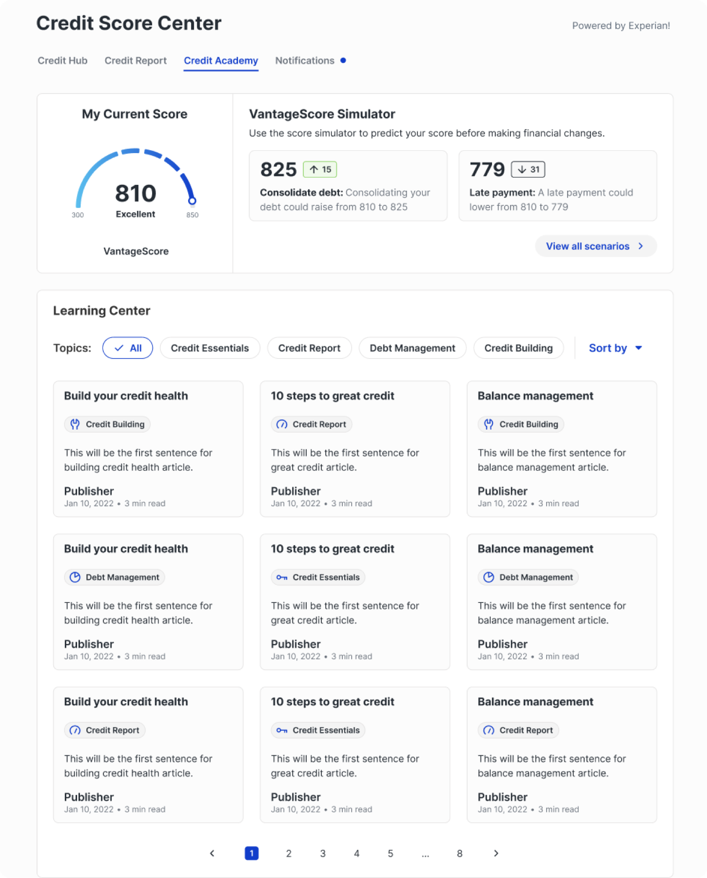
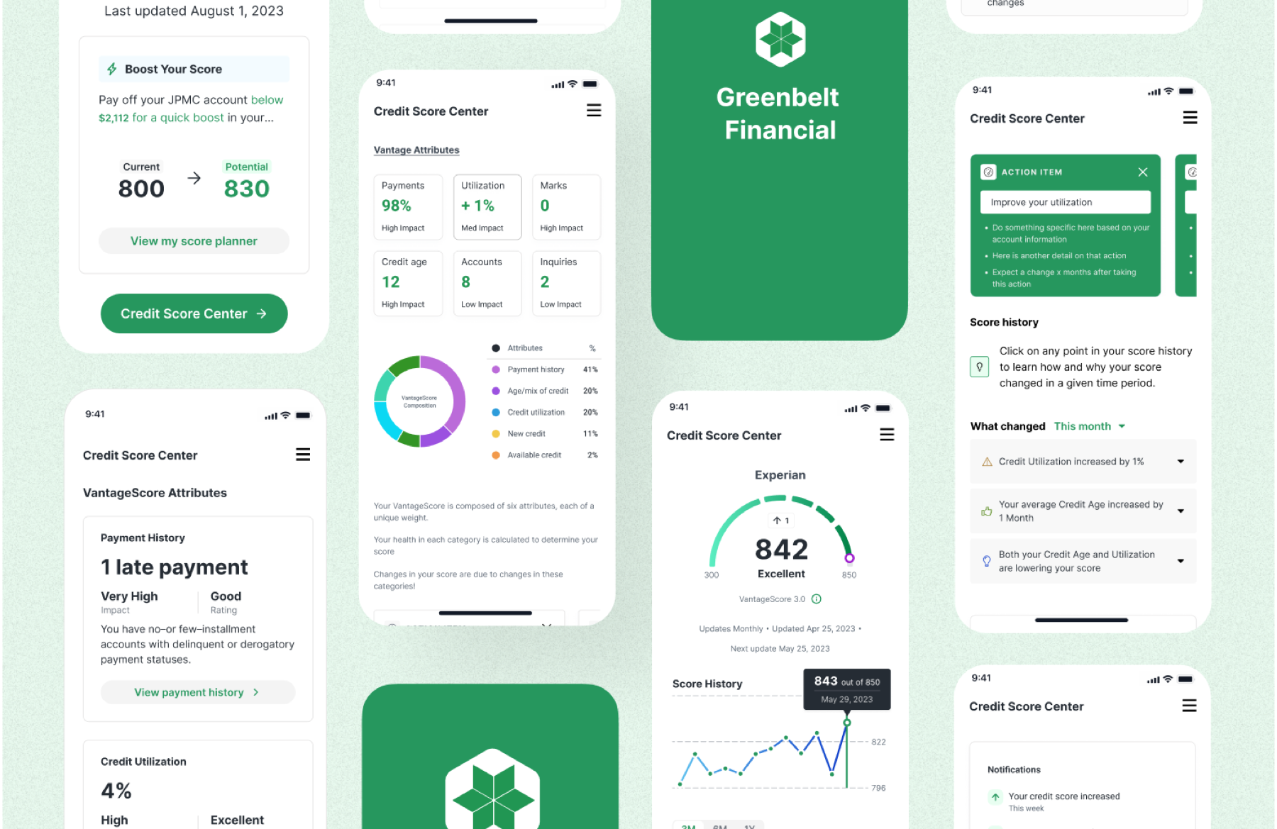
White-label, proven
The same components, two partner brands. This is what sold the system internally: partners could ship something that felt like their own product in days, not quarters.
Testing
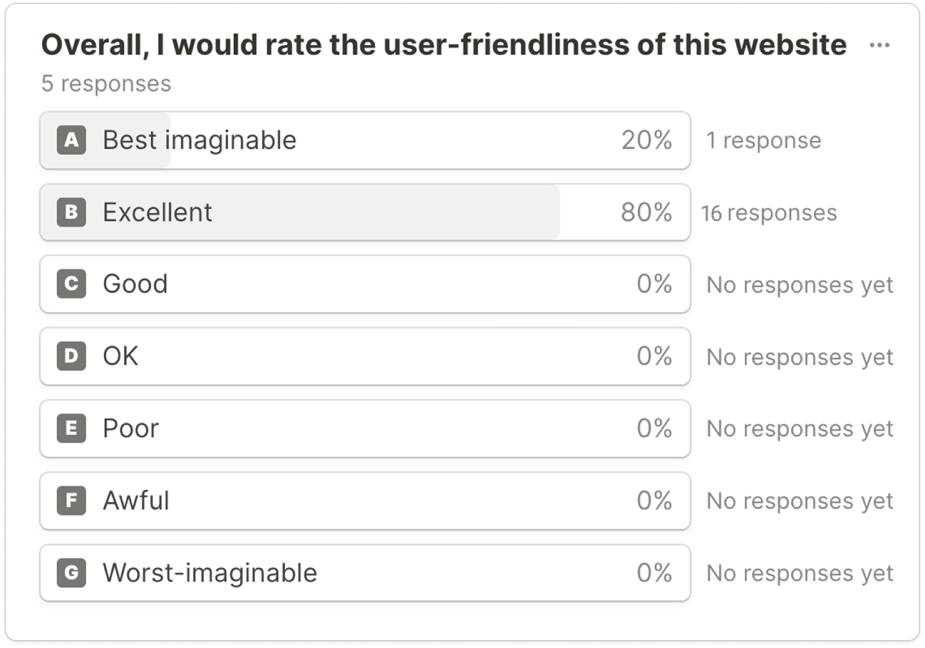
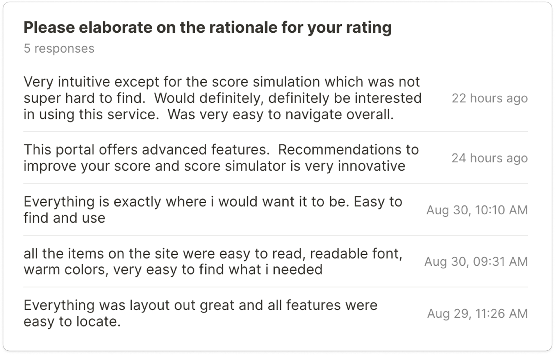
Usability testing was run against the high-fidelity prototype with users of partner banks. Every participant rated the experience Excellent or Best Imaginable, and the product scored 98.4 on the System Usability Scale — well above the 68 average. Users consistently preferred it to the credit monitoring tool they were already using.
Outcome
- 98.4 SUS in testing.
- 46% increase in user interactions with credit insights after launch.
- A modular white-label system that partners could brand and ship without an Experian design review.